PROPS
LAUREN HENKIN
CONTEMPORARY ARTS CENTER
CINCINNATI, OH
11.22.19 – 03.01.20
CURATED BY STEVEN MATIJCIO
DIRECTOR & CHIEF CURATOR
BLAFFER ART MUSEUM AT THE UNIVERSITY OF HOUSTON
PROPS
LAUREN HENKIN
CONTEMPORARY ARTS CENTER
CINCINNATI, OH
11.22.19 – 03.01.20
CURATED BY STEVEN MATIJCIO
DIRECTOR & CHIEF CURATOR
BLAFFER ART MUSEUM AT THE UNIVERSITY OF HOUSTON
PROPS
Cincinnati, Ohio, 11.22.19-03.01.2020
Curated by Steven Matijcio
ABOUT PROPS
While studying architecture as an undergraduate, I experimented with the relationships between constructed forms and the natural landscape, and how scale affects those relationships. Working primarily in models, I created architecture as interventions into existing conditions, with an interest in fostering experiences that enlivened the senses while proposing a more integrated approach to how architecture relates to its surrounding environment.
For the last two decades, I have used art as a means to test these interactions, emphasizing the dialog between structure and landscape, and body and structure. My practice today continues to explore these same principles. This exhibition, Props, explores these principles within the museum context.
Props are interventions within Zaha Hadid’s Rosenthal Center (the first Museum in the U.S. designed by a woman) that activate underutilized areas by purposefully engaging the contexts in which they reside. The locations are spaces where viewers aren’t expecting to see art—restrooms, hallways, and stairwells, where art has never been shown in the building. I wanted to expand and challenge one’s understanding of what “site specific” installation and sculpture are, while asking the viewer to confront their perception of what art is and how to engage it.
Is this art? Should the environment for viewing art (especially in museums) be extended beyond the gallery spaces? How does our ability to engage and evaluate art change when we’re asked to look beyond traditional art-viewing spaces? How does a shift or recognition of that ability impact our experiences beyond the museum? All of these questions are ones that were repeated in my process of creating.
“Props will make people ponder, laugh, and question their assumptions. In the in-between, Lauren plants radicals that illuminate via disorientation. Props is so captivating because it plays with the idea of the provisional in a playful, yet poignant way.”
Steven Matijcio, Director and Chief Curator
Blaffer Art Museum at the University of Houston
Lauren Henkin discusses the process behind her exhibition, Props, a series of site-specific sculptural installations for the Contemporary Arts Center.
CREDITS: Video produced by Contemporary Arts Center. This exhibition is generously supported by ArtsWave, the Ohio Arts Council and the Maine Arts Commission, an independent state agency supported by the National Endowment for the Arts. Direction by Asa Featherstone, IV and Shawnee Turner. Videography by Asa Featherstone, IV and Alyssa Maurer. Editing by Asa Featherstone, IV. Music, "Waves," by Podington Bear from Textural, 2017.
GRANT SUPPORT
The creation of Props is funded in part by a grant from the Maine Arts Commission, an independent state agency supported by the National Endowment for the Arts.


THANKS
As with any large endeavor, there were many people working together to make Props happen. My personal thanks and gratitude to Richard Benari, Raphaela Platow, Amara Antilla, Molly Krause, Joe Civitello, Dave Gearding (and the entire facilities team at CAC), Asa Featherstone, Shawnee Turner, Jeremy Kramer, Rebecca Roman, everyone at exhibit3, and especially Steven Matijcio, for his creativity, support and adventurous spirit.
MEDIA CREDITS
All process images by Lauren Henkin. All still in situ images by Jeremy Kramer. All in situ videos by Asa Featherstone and Alyssa Maurer.
INTERVENTIONS
ABOUT PROPS / PRESS / ABOUT CAC / EXHIBITION INFO / CATALOG
PROP 1
Location Ground Floor
Materials Wood, Adhesive, Metal
Size ~ 4' x 6' x 30"

Ground Floor: Prop 1 Location
When I first saw this space, I was struck by the rigid geometries of the surrounding urban environment. By siting the piece immediately as you walk into the building, there is an instant engagement with art that is unexpected.

Existing Space
My initial response was to break that formal language using an elemental and residential building material, cedar shingles. I experimented in the studio, creating models at varying scales to test the idea, and begin formalizing the shape.

As the thoughts became more specific, I jumped scale, focusing on how the size would relate to the body and how the form could creating viewing through fractilized portals, creating a dialog with the busy streetscape.

Concept Rendering

CREATING THE FINAL PIECE

fabrication detail
PROP 1 IN SITU
INTERVENTIONS
PROP 2
Location Ground Floor
Materials Concrete, Board, Foam
Size ~ 10’ x 5’ x 40”

Ground Floor: Prop 2 Location
Prop 2 is located on the ground floor facing Walnut Street. The space is occupied by a lone concrete stool, which looks to be there only to complement three more that are on on the outside of the building (likely to prevent skateboarders from enjoying the “Urban Carpet” wall. I wanted to complete this thought on the interior, creating other concrete forms that look as if they’re twisting or morphing into the shape of the existing stool.

Existing Space
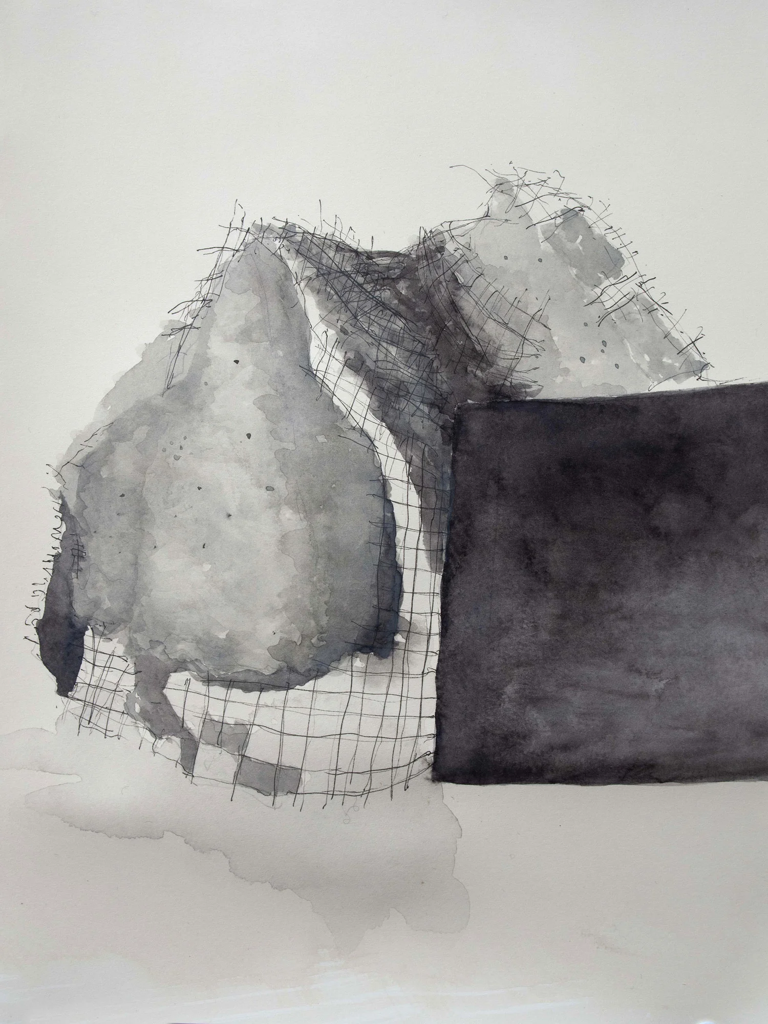
I began sketching in watercolor, loosely developing the idea.


As the forms began to take shape, I became more specific in dimensioning, scale and rotation of the pieces.
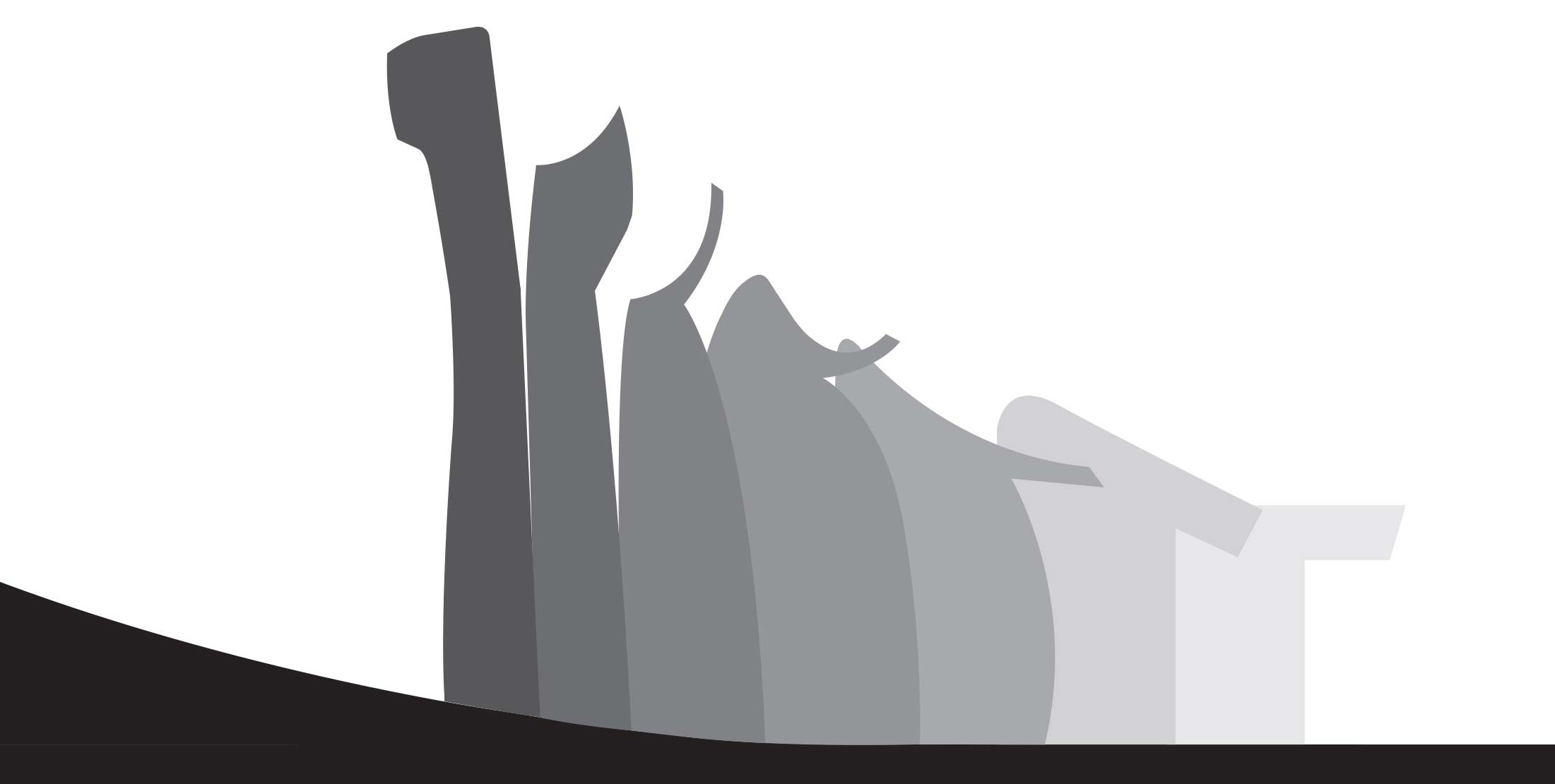
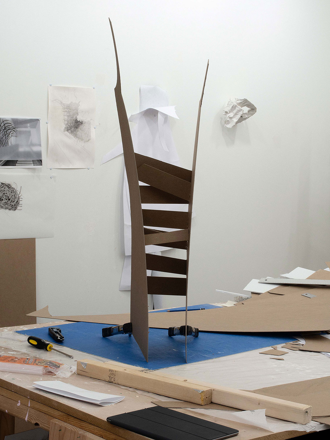


Concept Rendering

fabrication process


PROP 2 IN SITU
INTERVENTIONS
PROP 3
Location Ground Floor
Materials Concrete, Steel, Foam, Paint, Lights
Size ~ 5’ x 15’ x 8’

Ground Floor: Prop 3 Location
Prop 3 is located in between Zaha Hadid’s “Urban Carpet” wall and the ground floor steel stairwell, a space that exists to emphasize the forms that create it. The space feels weighty with the tall, curved concrete wall to the left and the black steel stairwell to the right. The ground plane feels as if its shifting, with the edge of the wall bleeding into the floor and flattening in a diagonal through the space.
In a 2001 interview with Mohsen Mostafavi titled “Landscape as Plan,” Zaha Hadid refers to two principles (for other projects, not CAC) which guided my process for Prop 3. First she talks about an exterior landscape being sucked into the interior of the building, which is how I interpreted her meaning in the placement and design of the “Urban Carpet.” Second, she refers to a “multiplicity of grounds” and “the ground as a layered topography, peeling and warping and multiplying the ground surface.”

Existing Space
I wanted to extend her thoughts, while interjecting my own interpretation of how that space might be subdivided to create several smaller spaces which can be experienced from various perspectives (including as one descends from the stairwell).
This was an immersive exploration, shifting back and forth between model-making, drawing and photography; each medium allowing a deeper understanding of the space and its potential.


I wanted to use materials that were present in the space, but expose some of what was embedded in them. While normally steel mesh plays a supporting role in a concrete structure, I did the reverse, making the steel the structural element, supporting broken pieces (or planes) of concrete, which, when formed, create multiple spaces to be explored while breaking the existing space between the “Urban Carpet” and stairwell into multiple smaller ones.

I created a 1”:1’ model of the space and photographed each creation from various angles, trying to get a sense of how the scale of the piece would feel and how the piece would change from various perspectives.


Concept Rendering

fabrication process

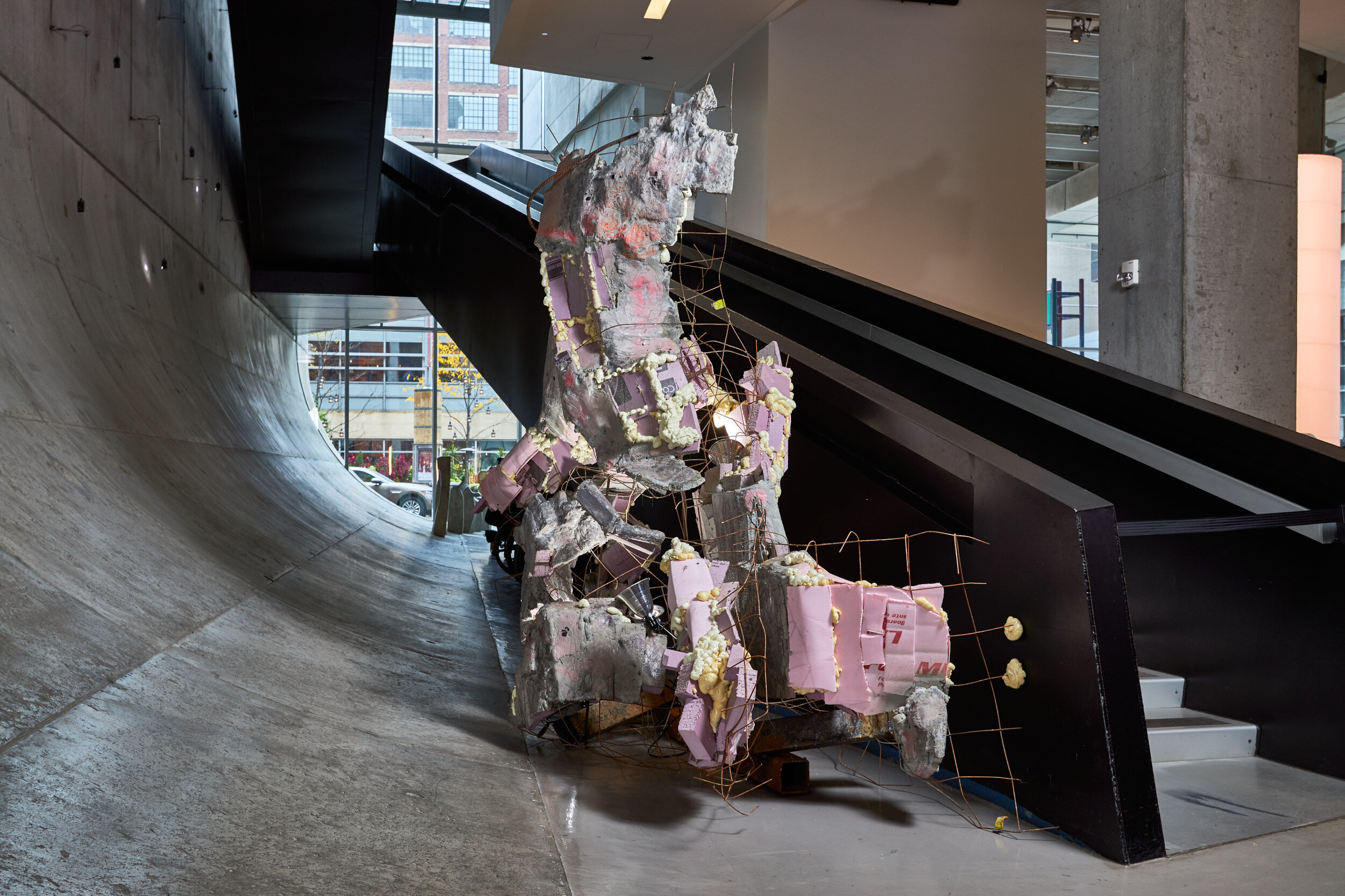
PROP 3 IN SITU


INTERVENTIONS
PROP 4
Location Second Floor
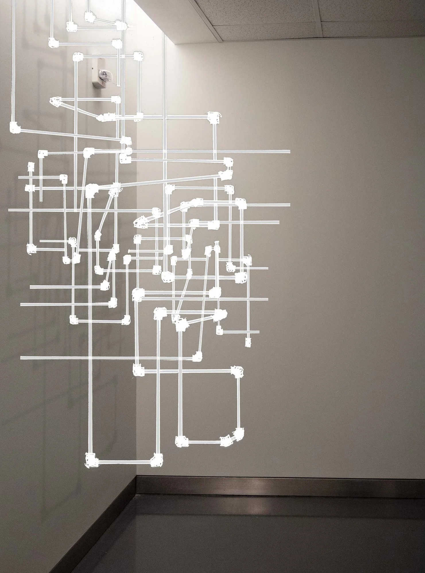
Materials PVC Pipe, Cement
Size ~ 2’ x 6’ x 8’

Second Floor: Prop 4 Location
One of the goals of this exhibition was to present art in unexpected places throughout the building. Many of the areas that seemed underutilized were ones meant for circulation. One such area was a hallway leading to the women’s restrooms on the second floor. The hallway has a nice stream of light coming down the left wall and it’s a space that would offer an opportunity for a surprising engagement with art.

Existing Space
I wanted to use a material that would be expected in a restroom, but formed to make one wonder whether what they were looking at is art, or a remnant from construction. I created a model of the space and worked with pieces of wood to begin engaging the meeting of the two walls and the well of light coming from the ceiling.


I selected multiple widths of PVC pipe, using varying coupling fasteners to create a form that references a complex city grid emerging out of the walls and ceiling.
Concept Rendering

fabrication process
PROP 4 IN SITU
INTERVENTIONS
PROP 5
Location Third Floor Stairwell Landing
Materials Wood, Metal, Magnets
Size ~ 12’ x 12’ x 15’

Third/Fourth Floors: Prop 5 Location
The environment for Prop 5 is the third floor stairwell landing. It’s a dynamic space with engagement around the landing as well as looking down (onto the floating glass plane skylight—see Prop 6) and above to higher floors.
This is a space I was immediately drawn to because it offered the opportunity to create a sculpture that’s boundaries were hard to define and that could expand the ways in which we’re used to experiencing sculpture—instead of moving around it or having a purely frontal perspective, one would be able have completely different engagements with it as the space is traversed from above or below.

Existing Space
My first response was to create a form that looked suspended between these two planes while also fractilizing the space. I began with some initial sketches and quickly moved to larger scale models where I was better able to test ideas about scale, light and form.


As the idea became more fully formed, I felt that compressed plywood and unfinished lumber would be the best materials to use. It would bring a rough, unfinished quality to the space that would hold its own in terms of visually weight when perceived with the steel stairwells.


Concept Rendering

prop 5 in situ

INTERVENTIONS
PROP 6
Location Between 2nd and 3rd Floors (Glass Skylight Plane)
Materials Wood, Acrylic, Metal, Velcro
Size ~ 13’ x 10’ x 8’

Between Second and Third Floors on Glass Skylight: Prop 6 Location
Zaha Hadid designed an incredible plane of glass in between the second and third floors to help filter light down to the ground level. The plane is not accessible, but can be viewed from above and below. One end of the plane intersects the large glass exterior wall at one end of the building which I felt would be a very interesting space to work with—particularly because it could not be experienced on foot.

Existing Space
There were a few considerations for this space that were unique in the exhibition—the materials would have to be lightweight enough to be supported by the glass; it would need to be installed in pieces; while the piece would only be able to be viewed from above (over one balcony), I wanted the viewer to be able to experience the entire area, as if they were standing there; and despite the perspectival limitations, I wanted the piece to still retain a formal sculptural quality.
I began sketching and then moved to larger models, creating pieces that referenced tripods or light boxes; objects that would stand upright and face the viewer looking down from the stairway landing above.


The drawings evolved as I explored material options, becoming specific after discovering mirrored acrylic, which would be a lightweight material that would reflect what was happening in the space upward.


Concept Rendering

PROP 6 IN SITU
INTERVENTIONS
PROP 7
Location Fourth Floor Hallway
Materials Electrical Cable
Size ~12' x 8' x 1'

Fourth Floor Hallway: Prop 7 Location
The Prop 7 location is on the fourth floor in the hallway that leads to staff office space and restrooms. I wanted one of the interventions in the exhibition to be located in a space that serves primarily as a functional space. These are areas in any building which aren’t the “wow” spaces, but ones that serve some fundamental purpose for circulation or storage or “back-end” activities. It isn’t likely that a visitor would find this space, making the ones that do participants in a more intimate act of discovery and open to the idea that art can be found anywhere.

Existing Space
My first response to this space was that it’s very sterile and clearly not meant for engagement (despite the bench). I took notice of the two electrical panels in the middle of the space and started playing with materials that I imagined were behind the walls.
Working with the materials led me to the idea of creating bulbous forms scattered throughout the space that would weave in and out of the walls and engage the bench, creating patterns of shadows and breaking the flat, stoic nature of the space.


concept rendering

fabrication process

fabrication process

PROP 7 IN SITU


INTERVENTIONS
PROP 8
Location Lower Level Men's Bathroom
Materials Aluminum, Steel, Varnish
Size ~ 30” x 30” x 3’

Lower Level Men’s Bathroom: Prop 8 Location
The men’s restroom in the lower level of the Museum offered an opportunity to, like the women’s restroom intervention, create an experience with art that is unexpected. I wanted to create a piece that would occupy the far corner of a nook where the sinks are that would project outward into the space, interrupting the small space in a way so that it would be hard to ignore this piece near the ceiling.

Existing Space
I began working with models to better understand the scale of the space and how the form should work within it.


Concept Rendering

PROP 8 IN SITU

CLICK TO ENLARGE.
PRESS
PRESS
"With the opening of artist Lauren Henkin's new show Props late last month, visitors to Cincinnati's Contemporary Arts Center will find new ways to appreciate the Zaha Hadid–designed museum. Henkin, a gifted photographer and sculptor with a background in architecture, has constructed eight interventions into the building’s interior, creating works for spaces that were not intended for art exhibition, and building a compelling dialogue between artist and architecture."
"Lauren Henkin’s series of sculptural interventions in unexpected spaces is giving the late architect’s first US building a new slant."
"...Henkin attempts to celebrate and shake the structure’s complexities through the heft of sculpture and subtlety of art. And in doing so, she engages her audience in an act of architectural interaction: 'Activating these spaces beyond their intentions gave me an opportunity,' she says, 'to challenge myself as an architecture-trained artist at a museum with incredibly persuasive architecture.'"
"The pieces dissolve into walls, hug corners, and playfully grow out from the floor. In this regard, the Props do not come off as menacing or insulting in any way. Instead, they feel like discreet, optimistically friendly characters, producing compelling moments of their own that stop us in our tracks."
"‘We contemplated how her provisional sculptural interventions could activate in the CAC's Zaha Hadid building, which was designed to disorient audiences and open them up to revised forms of navigation through museum space' Matijcio told Dezeen.’"
ABOUT CAC
ABOUT CAC

Contemporary Arts Center, Cincinnati designed by Zaha Hadid.
Image courtesy CAC.
“...The Rosenthal Center is the most important American building to be completed since the end of the cold war.”
— Herbert Muschamp
New York Times, June 2003
About CAC
Contemporary Arts Center, Cincinnati, is a non-collecting museum that spent its first years in the basement of the Cincinnati Art Museum, followed by a move in 1964 to the downtown Women’s Exchange Building and in 1970 to the Mercantile Center on Fifth Street where it occupied 10,000 square feet of exhibition space. At the time, it was was one of the largest exhibition venues in the U.S. dedicated to contemporary art.
In 2003, CAC moved into the Lois & Richard Rosenthal Center for Contemporary Art, designed by Zaha Hadid, an Iraqi-British architect who was the first woman to receive the Pritzker Architecture Prize (in 2004). The Rosenthal Center was the first U.S. museum designed by a woman.
The Rosenthal Center has more than 16,000 square feet of exhibition space, a dedicated black box performance space and the Sara M. and Patrica A. Vance UnMuseum, and 6,600 square foot multi-generational exhibition and education space.
About Zaha Hadid
Zaha Hadid was an Iraqi-British architect (b. 1950, d. 2016). She won multiple awards including the Pritzker Architecture Prize in 2004 (she was the first woman to do so), the Stirling Prize in 2010 and 2011, and in 2015 she became the first and only woman to be awarded the Royal Gold Medal from the Royal Institute of British Architects.
Major works include the aquatic centre for the London 2012 Olympics, Michigan State University’s Broad Art Museum, the MAXXI Museum in Rome, the Guangzhou Opera House in China, and the Beijing Daxing International Airport.
Zaha Hadid is widely considered one of the most inventive and daring architects of a generation. Her work is so distinctive it’s hard not to know that you’re looking at a Zaha building.
Following her death in March 2016, Michael Kimmelman of The New York Times wrote, her “soaring structures left a mark on skylines and imaginations and in the process re-shaped architecture for the modern age ... Her buildings elevated uncertainty to an art, conveyed in the odd way of one entered and moved through these buildings and in the questions that her structures raised about how they were supported ... Hadid embodied, in its profligacy and promise, the era of so-called starchitects who roamed the planet in pursuit of their own creative genius, offering miracles, occasionally delivering."
Her work continues through the firm she started, Zaha Hadid Architects.
EXHIBITION INFO
ABOUT PROPS / INTERVENTIONS / PRESS / ABOUT CAC / CATALOG
EXHIBITION INFO
Exhibition Dates
The Props exhibition, in full, was on view from November 22, 2019 - March 1, 2020. Three pieces will continue to be shown through 2021.
Museum Hours
Saturday–Monday: 10am–4pm
Tuesday: Closed
Wednesday–Friday: 10am–9pm
Please check with the Museum regarding COVID-19 closures and policies.
Location
CAC is located at 44 E. 6th Street (the corner of 6th and Walnut Streets) in downtown Cincinnati. Street and lot parking are available. See here for more information on directions and parking.
EXHIBITION CATALOG
EXHIBITION CATALOG
An exhibition catalog was published by Vela Noche Press in 2021. Steven Matijcio wrote an original essay, Parasites & Prop[osal]s for the 68-page book which acts as documentation for both process and actualization.
The book was funded in part by a grant from the Maine Arts Commission, an independent state agency supported by the National Endowment for the Arts.


